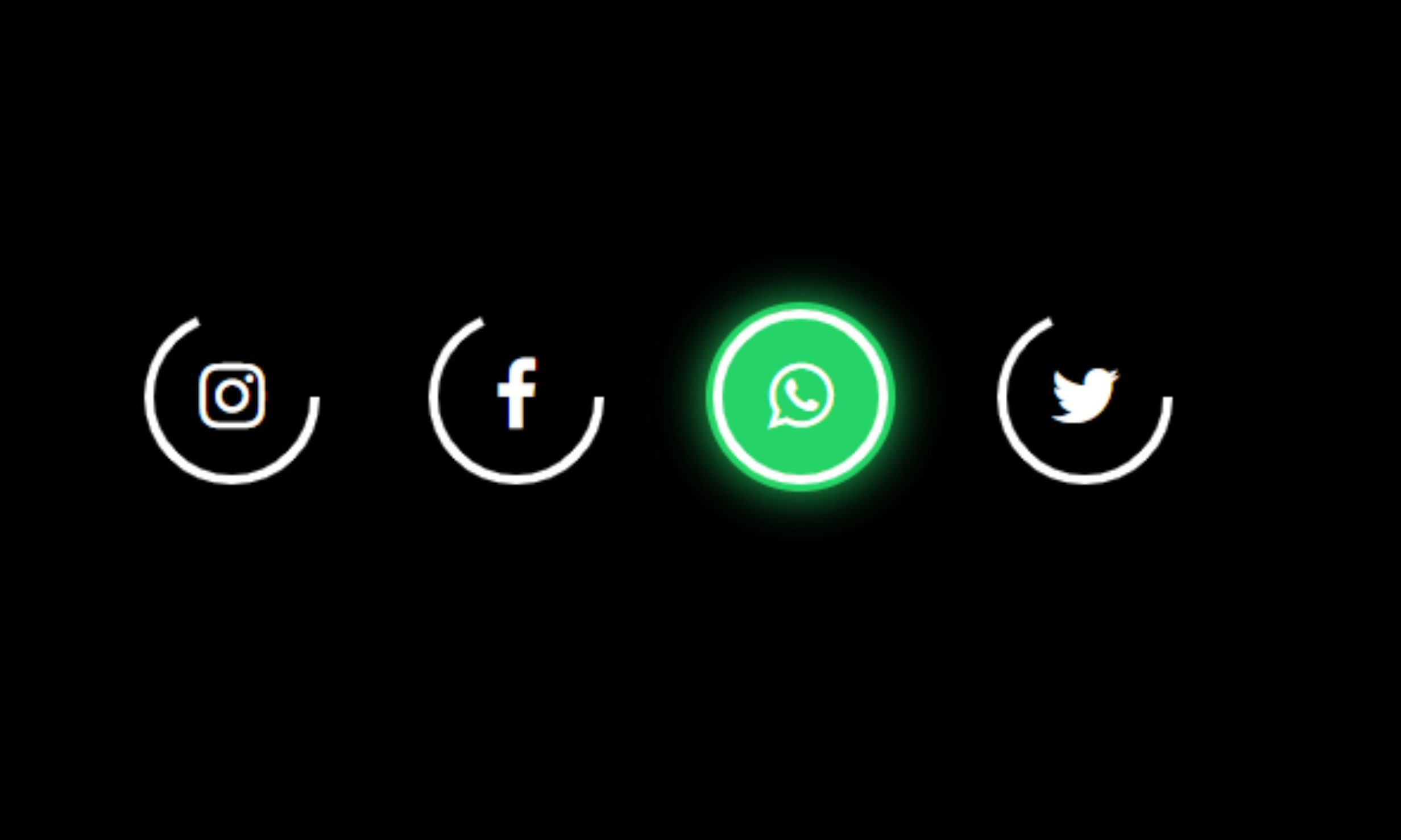
This tutorial will show you how to create a glowing hover effect on icons and buttons using HTML and CSS. You can use this effect for social media icons or any other icons.
Blog Description: In this tutorial, we will create a glowing hover effect on social media icons using HTML and CSS.
It’s a popular trend to create glowing hover effects on buttons and icons using pure CSS.
In this article, we will go through the steps to create a glowing hover effect on different social media icons using HTML and CSS.
STEP 1 – Create an HTML File And Add This Code
HTML
<div class="main">
	<div class="icon">
		<svg height="80" width="80">
			<circle cx="40" cy="40" r="35" stroke="white" stroke-width="4" fill="none"></circle>
		</svg>
		<i class="fab fa-instagram fa"></i>
	</div>

	<div class="icon">
		<svg height="80" width="80">
			<circle cx="40" cy="40" r="35" stroke="white" stroke-width="4" fill="none"></circle>
		</svg>
		<i class="fab fa-facebook fa"></i>
	</div>

	<div class="icon">
		<svg height="80" width="80">
			<circle cx="40" cy="40" r="35" stroke="white" stroke-width="4" fill="none"></circle>
		</svg>
		<i class="fab fa-whatsapp fa"></i>
	</div>

	<div class="icon">
		<svg height="80" width="80">
			<circle cx="40" cy="40" r="35" stroke="white" stroke-width="4" fill="none"></circle>
		</svg>
		<i class="fab fa-twitter fa"></i>
	</div>

</div>
STEP 2 – Add This CSS Code
CSS
<style type="text/css">
		*{
			margin: 0;
			padding: 0;
		}
		body{
			background-color: black;
			width: 100px;
			height: 100vh;
		}
		.main{
			position: absolute;
			top: 50%;
			left: 50%;
			transform: translate(-50%,-50%);
			display: flex;
			cursor: pointer;
		}
		.icon{
			position: relative;
			width: 80px;
			height: 80px;
			margin: 20px;
			border-radius: 50px;
			transition: all .8s;
		}
		.icon:hover{
			background: #e60073;
			box-shadow: 0 0 20px #e60073;
		}
		.icon:hover:nth-child(2){
			background: #1877f2;
			box-shadow: 0 0 20px #1877f2;
		}
		.icon:hover:nth-child(3){
			background: #25d366;
			box-shadow: 0 0 20px #25d366;
		}
		.icon:hover:nth-child(4){
			background: #1da1f2;
			box-shadow: 0 0 20px #1da1f2;
		}
		.icon i{
			color: white;
			position: absolute;;
			top: 50%;
			left: 50%;
			transform: translate(-50%, -50%);
			font-size: 2em;
		}
		svg circle{
			stroke-dasharray: 150;
			transition: all .8s;
		}
		.icon:hover svg circle{
			stroke-dasharray: 220;
		}
	</style>
STEP 3 – Add This font-awesome CDN Link in Head Tag Of That HTML File
CDN Link
<link rel="stylesheet" href="https://cdnjs.cloudflare.com/ajax/libs/font-awesome/4.7.0/css/font-awesome.min.css">